askTax - Designing an AI tax assistant people can actually act on
Thesis: For an AI tax assistant, the product isn't the answer. It's the evidence. The hard design problem wasn't the chat UI; it was making every response auditable enough that a specialist would stake a client filing on it, while staying readable enough that a salesperson could understand it too.
For the reader: If you're hiring a product designer who treats trust, accessibility, and design-to-build fidelity as first-class design problems - not polish applied at the end - this one's for you.
Project Overview & Context
The hook
Most "AI chatbot" designs optimize for the answer. In corporate tax, a confident answer you can't trace to a primary source is worse than no answer - it manufactures false confidence in a domain where being wrong is expensive and slow to discover. askTax is a design concept for an internal AI tax assistant built around the opposite premise: the answer is the cheap part, and the design job is to surround it with enough evidence, freshness, and verification that a professional will act on it.
It's one product serving two very different people at once - the corporate tax specialist who wants depth, citations, and jurisdiction control, and everyone else in the company (PMs, sales, support, engineers) who just needs plain-language literacy and to know how to use the company's own apps.
My role
Solo Product Designer - end to end. I owned:
- Problem framing and the dual-persona definition
- Information architecture across ~10 screens (employee app + back-office "Studio")
- Interaction and visual design, including the trust/citation system
- The design system: tokens, type scale, spacing, color, component library
- Accessibility (WCAG AA contrast, focus, touch targets)
- A build-ready spec in shadcn/Tailwind token vocabulary
- Running and acting on a structured, multi-model design critique loop
Timeline & tools
- Timeframe: Focused design sprint (May 2026): two structured review rounds on the core flow plus a first round on the extended/back-office screens.
- Tools: A multi-model design-review orchestrator (Claude, Gemini, and Codex each scoring the comps against a 10-dimension rubric), HTML/CSS comps as the working medium, Inter type system, an 8px spacing system, and shadcn/ui + Tailwind HSL design tokens as the build target.
- Surfaces designed: Desktop (1440×900) and mobile (390×844), responsive.
The Problem Statement
The challenge
The company set a mandate that every employee should understand what the company does - and simultaneously needed its tax specialists to work faster and more defensibly. That created a single product brief with a built-in contradiction:
- Specialists need depth: real citations (IRC sections, internal memos, state guidance), jurisdiction awareness (Federal + state), freshness ("is this still current law?"), and a way to escalate edge cases.
- Everyone else needs the opposite: plain-language answers and step-by-step help using the company's 12 internal apps, without being buried in tax jargon.
A generic LLM chat window fails both. It gives specialists answers they can't trust or trace, and it gives non-specialists a blank box with no idea what to ask. The core tension: how do you build one surface that flexes from "auditable enough to file against" to "simple enough for a new hire," without splitting into two products and two knowledge bases?
Objectives
- Make answers trustworthy and auditable - every claim traceable to a primary source, with visible freshness, jurisdiction, and human verification.
- Serve both audiences from one surface - adjustable depth/role rather than a separate "lite" app.
- Turn "how do I use our apps" into doing, not reading - guided, in-context walkthroughs for the 12 internal apps.
- Be genuinely accessible - clear WCAG AA, real focus states, mobile-safe touch targets.
- Ship as a build spec, not a picture - design in the exact token system engineers would implement (Next.js + shadcn/ui + Tailwind).
Process & Methodology
Research & insights (framing and validation)
I started by separating the audience into a primary power user (tax specialist) and a secondary literacy user (developer / PM / sales / support), because nearly every design decision downstream depended on which one a given screen was serving - and on realizing that the same screen often has to serve both at once.
The competitive frame was the generic AI chatbot. Its failure modes in this domain are predictable: a "Sources" list dumped at the bottom of an answer (or none at all), no concept of jurisdiction or effective date, no human-verification signal, and a cold-start blank input that gives non-experts nothing to grab onto. Each of those failure modes became a design requirement.
For validation, I used a structured multi-model expert review rather than relying on a single opinion: three models (Claude, Gemini, Codex) independently scored each round of comps against a 10-criterion rubric - Visual, Typography, Color, Accessibility, Usability, Information density, Consistency, Responsiveness, Interaction, and Emotional tone. This gave me a repeatable, quantitative signal on where the design was weak and a prioritized punch list for each iteration. (Heuristic/expert review is a deliberate early-stage method here; testing with real specialists and non-specialists is the named next step - see What I'd do differently.)
Iteration: review rounds, not guesses
I treated each round like a test with a score to beat, and let the rubric tell me what to fix next.
Core workspace (Ask / Guides / Saved):
| Round | Score (avg / 100) | Weakest dimensions going in |
|---|---|---|
| 1 | 81.7 | Color contrast, Accessibility |
| 2 | 80.7 | Interaction, Accessibility (next layer) |
Round 1 → Round 2 changes I made:
- Contrast: muted metadata text was
#838c9b(~3.5:1 on white) - below the 4.5:1 AA floor. Darkened to#5b6472(~6:1) so the 11-13px labels every reviewer flagged now clear AA. - Focus: added a visible, non-color focus ring + caret on the composer to support keyboard users.
- Touch targets: mobile action buttons, send, and filter chips were ~38px - bumped to the 44px minimum.
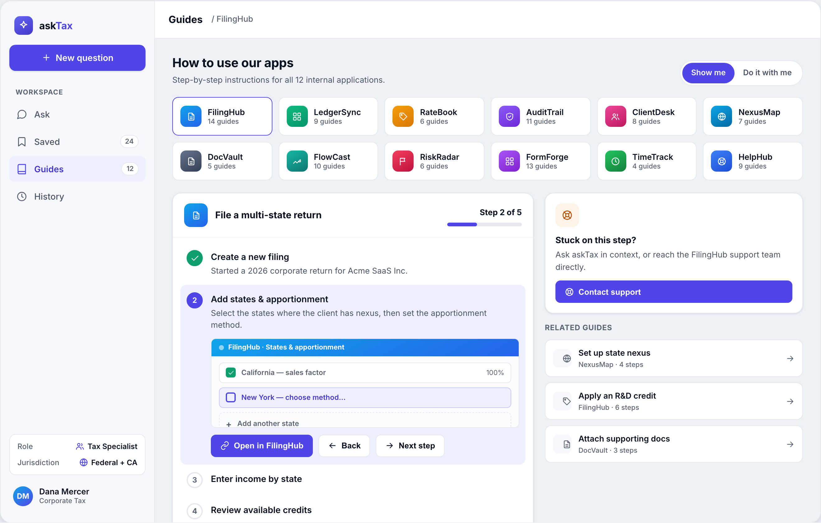
- Concreteness: replaced a placeholder guide thumbnail with a faux FilingHub mini-UI (a verified CA row, an active NY row, an "add state" row) so the "do it with me" step shows something real instead of an icon.
- Guardrail copy: added a domain-appropriate disclaimer ("confirm against primary sources before filing") inline, without disrupting the layout.
An honest detail: the aggregate score dipped slightly (81.7 → 80.7) even though accessibility improved, because fixing the obvious problems let the rubric surface the next layer - answer line length (~80 characters per line; the measure should tighten to ~680px), missing breadcrumb/location cues on Guides and Saved, loose whitespace in the Saved grid on wide viewports, and the absence of explicit empty/loading/streaming states. That's the rubric working as intended: it keeps finding the next most important thing.
Extended / back-office ("askTax Studio"): A first review round scored 70.7, with strong marks for the source/citation viewer and the in-app companion concept, and clear weaknesses to address next (mobile coverage for Knowledge browse + History, denser back-office tables needing zebra rows / sticky headers, and more consistent focus states across tables and toggles).
Design decisions (the why)
The five decisions that mattered most:
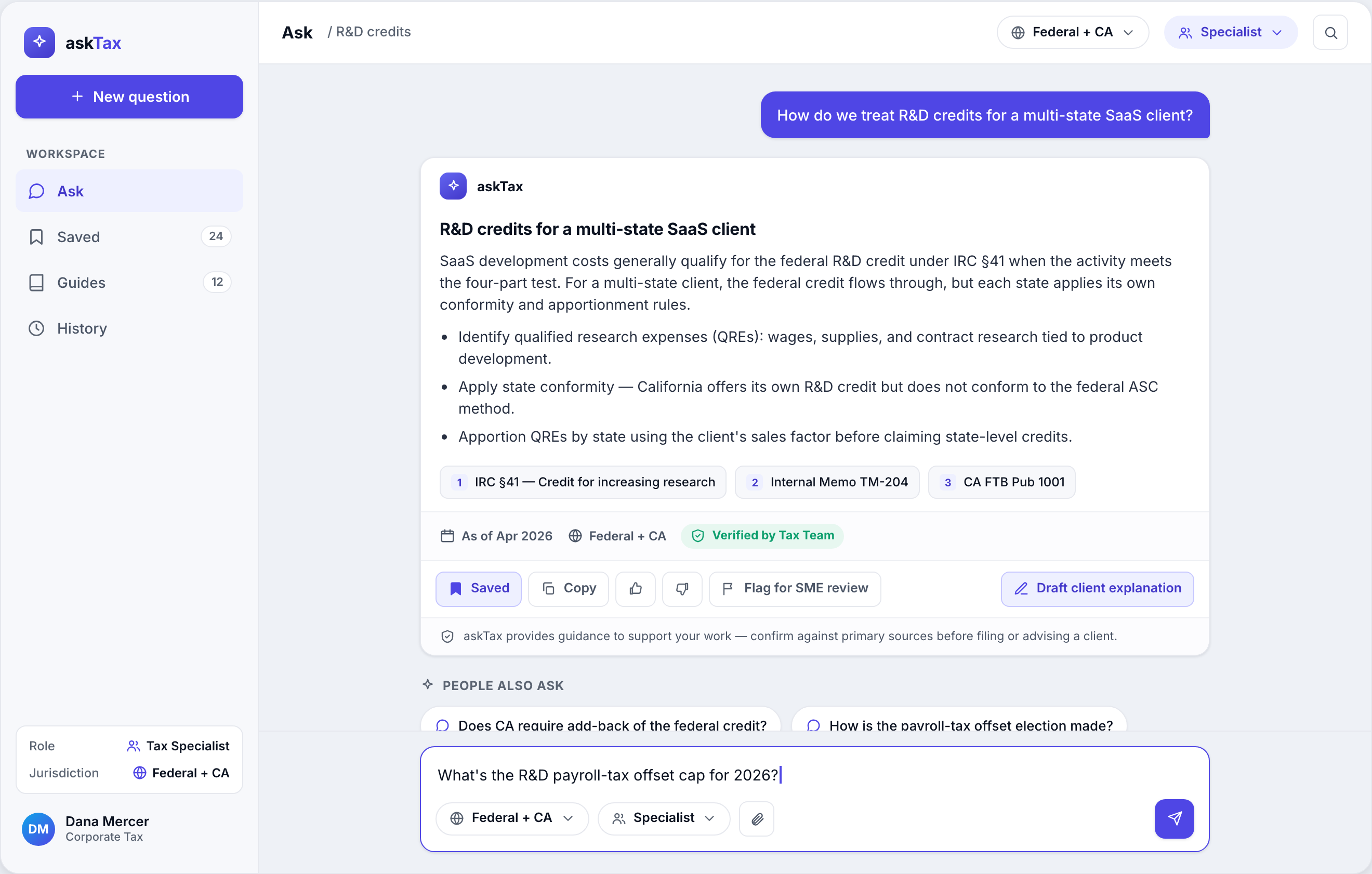
1. Citations are a first-class inline component, not a footnote.
Each claim carries inline numbered chips - [1] IRC §41, [2] Internal Memo TM-204, [3] CA FTB Pub 1001 - and a dedicated source viewer sets the answer beside the actual statute text with the operative passage highlighted and an effective date.
Considered instead: the LLM default - a generic "Sources" list at the bottom.
Why: In tax, traceability at the point of each claim is the product. It turns the AI from an oracle into an auditable research assistant, and lets a specialist verify in context rather than trust blindly.
2. Verification and escalation live inside the answer, not around it. Every answer shows an "As of Apr 2026" date, a jurisdiction tag (Federal + CA), and a green "✓ Verified by Tax Team" badge, plus a "Flag for SME review" (subject-matter expert) action. Considered instead: handling verification as a separate QA process outside the chat surface. Why: Tax answers decay (law changes) and vary by jurisdiction, so freshness and scope are part of the answer's meaning. Putting them inline tells the user exactly how much to trust this specific answer - and the flag turns every user into a sensor that feeds the content team's gap list.
3. One surface for two audiences via role + depth controls - not two products. A role selector (Specialist) and jurisdiction pill sit in the composer and left rail, and contextual "For your role" / "People also ask" suggestion chips adapt to who's asking. Considered instead: a separate "lite" experience for non-specialists. Why: Two products doubles maintenance and splits the knowledge base. Treating role and jurisdiction as adjustable lenses on one answer engine keeps a single source of truth while still flexing from specialist depth to plain-language literacy - and the suggestion chips solve the non-expert's blank-box problem.
4. "How do I use our apps" becomes a guided in-context walkthrough, not a doc site. The Guides surface offers a 12-app picker, step-by-step checklists with progress ("Step 2 of 5"), and a "Show me" vs "Do it with me" toggle. An in-app companion docks askTax beside the live app and ties the current step to what's highlighted ("click New York"). Considered instead: linking out to static help docs or a wiki. Why: Procedural knowledge is learned by doing. Guidance that points at the real UI is the genuine differentiator over both a generic chatbot and a knowledge base.
5. Design in shadcn/Tailwind tokens from day one, so the comp is the build spec.
HSL tokens (--background, --foreground, --muted, --primary, --border, --radius), Inter, an 8px spacing system, and a single confident indigo accent (#4F46E5), with green = verified and amber = flag.
Considered instead: designing free-form and handing off for interpretation.
Why: The build target was Next.js + shadcn/ui. Designing in the same token vocabulary collapses the design-to-dev gap - and accessibility decisions (contrast, focus, target size) get made in the exact units engineers ship.
The Final Solution
A responsive, tokenized system spanning the employee app and a back-office Studio. Visual language: modern fintech - crisp neutrals, one confident indigo accent, strong type hierarchy, subtle borders over heavy shadows, and an emphasis on data clarity and trust.
The employee app
- Ask - A focused conversation thread. A structured answer (headline + short paragraphs + bullets) carries inline citation chips, an "As of / jurisdiction / ✓ Verified" metadata row, and an action bar (Bookmark · Copy · 👍 · 👎 · Flag for SME review · Draft client explanation). Contextual suggested-question chips solve cold start; the composer exposes jurisdiction and role/depth controls.
- Guides - A 12-app picker plus a step panel with a numbered checklist (done / current / upcoming), a per-step instruction, a real mini-UI thumbnail, an "Open in [app]" CTA, the Show me / Do it with me toggle, and a "Stuck? Contact support" escalation.
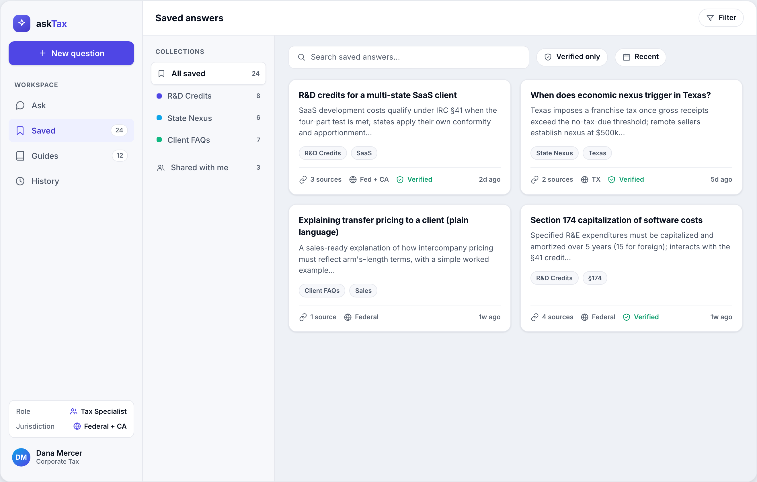
- Saved - A searchable, filterable library: a collections sidebar (All, R&D Credits, State Nexus, Client FAQs, Shared with me) and a card grid where each card shows the question, a snippet, source count, jurisdiction tag, verified badge, date, and tags.
The back-office ("askTax Studio")
A visually distinct dark-rail surface that reuses the same component system: the source/citation viewer (answer beside the real statute text, operative passage highlighted, effective date), the in-app companion docked beside the live app, and an admin gaps dashboard that surfaces low-confidence / no-source questions with ask volume and coverage bars - actionable signal for the content team, not vanity metrics.
Implementation reality
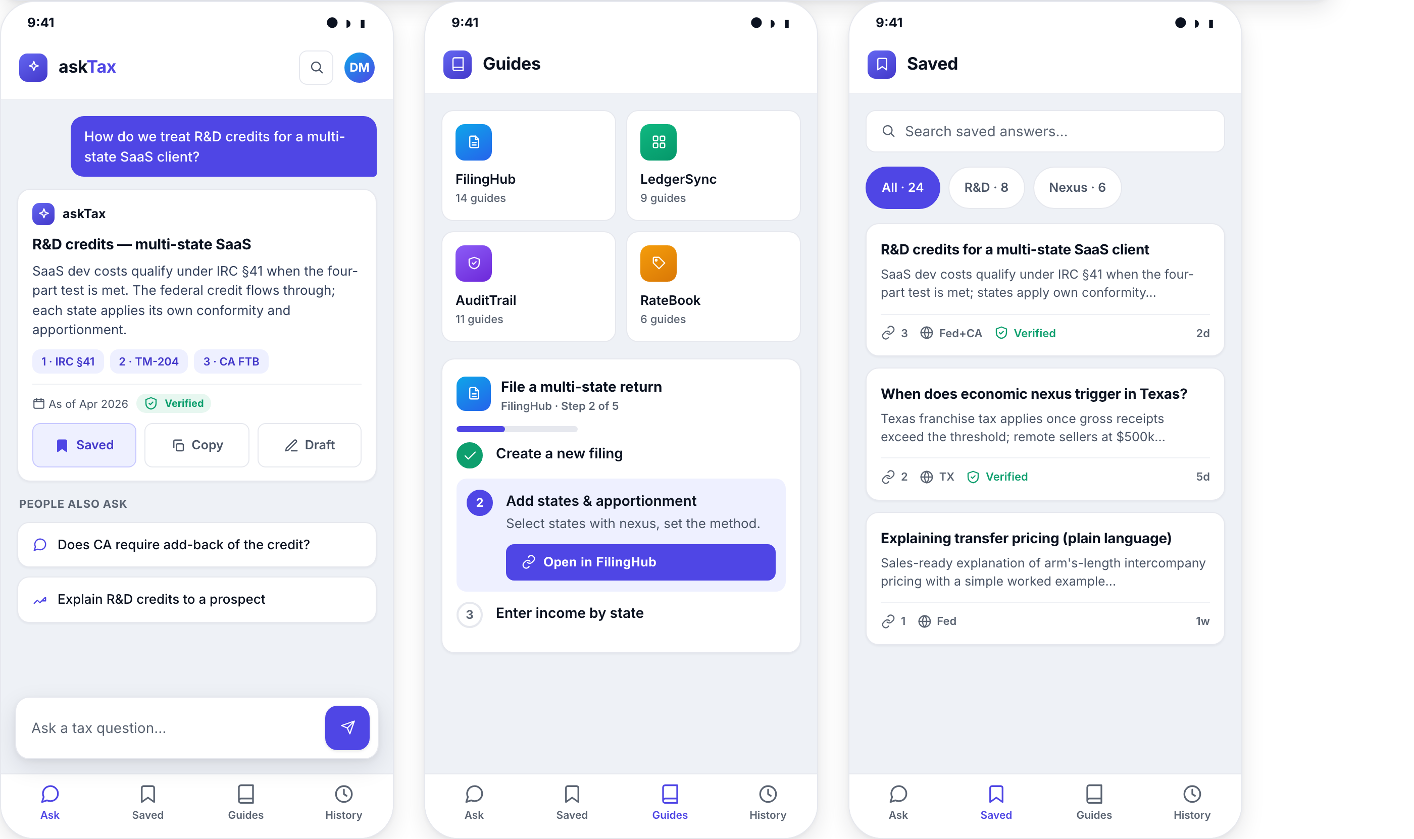
Designed responsively for desktop (1440×900) and mobile (390×844): phones drop to a bottom tab bar, a full-width composer, and stacked cards. Because everything is expressed in shadcn-translatable HSL tokens, Inter, 8px spacing, and shadcn default radii, the comps double as the implementation spec for a Next.js + shadcn/ui + Tailwind build.
Outcome & Impact
What changed
The work produced a complete, build-ready design language for an AI tax assistant, with the trust model - inline citations, source viewer, freshness, jurisdiction, human verification, and escalation - as its spine rather than an afterthought. The structured review loop turned subjective "looks good" debates into a prioritized, scored punch list, and made accessibility a measured outcome instead of an assumption.
Honest metrics
This is a design concept validated by structured expert review, so the numbers are design-quality and accessibility measures, not production business KPIs:
- Design-review quality: core workspace held at ~81/100 across a 10-dimension multi-model rubric (81.7 → 80.7 as deeper issues surfaced); back-office baseline 70.7 with a clear improvement path.
- Accessibility: muted-text contrast lifted 3.5:1 → ~6:1 (cleared WCAG AA); mobile touch targets ~38px → 44px; added visible non-color focus indicators.
- Concreteness: replaced placeholder guidance with a realistic app mini-UI, making the "do it with me" model legible rather than implied.
Learnings - what I'd do differently
- Design the in-between states first. An AI product lives in its empty, loading, and streaming states, and those were the most-cited gap by Round 2. Next time I'd storyboard "blank → thinking → streaming → answer → error" before polishing the answer card.
- Validate the dual-audience bet with real people. Multi-model heuristic review is a fast, repeatable early signal, but it's not a substitute for watching an actual specialist and an actual salesperson use the same screen. That's the next validation step, and it would either confirm or kill the "one surface, two lenses" decision.
- Define the verification ops model earlier. The trust system (Verified badges, Flag for SME, the admin gaps dashboard) only works if the human-in-the-loop content pipeline behind it is real. I'd specify that operational loop alongside the UI, not after it.
- Watch the aggregate-score trap. A flat or dipping composite score can hide real progress (accessibility improved while the average fell). I'd report per-dimension deltas, not just the headline number, so the story of what actually got better stays visible.